USA Ultimate Evaluation & Redesign
Overview
This takes a deep look into the ticket purchasing flow of the Denver Zoo's website. The redesigned proposal simplifies the process to increase the percentage of users who complete checkout. Additionally, it removes the clutter around the design to limit the distractions to the users and keep them focused on purchasing tickets.
Tools used: Figma, Zoom, UX testing sites
Research and Design
I conducted user testing by asking users to go through the ticket purchasing flow and observing their actions. This showed me common trip-ups and pain points for the flow.
Additionally, I looked at similar websites with ticket-purchasing features to see what works well and what doesn't.
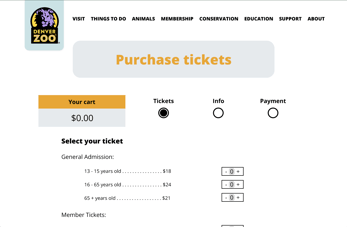
A common theme in the testing and the research was simplicity and user feedback. On sites with too many options, users were overwhelmed and did not know which choices were required. This, combined with user feedback, ie, letting the user know what step they are on, and how many remaining steps, created an intuitive process for those who had never purchased tickets on the site.
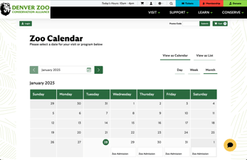
The Denver Zoo's site specifically had too many additional options along the purchasing process and did not tell users what step they were on, often leaving users confused.
Prototype and Mock-Ups
I used Figma to create the mid and high-fidelity wireframes. From the HF frames, I was able to create a clickable prototype. That can be accessed here.
Get in touch
nbuchholz24@gmail.com
LinkedIn
Download resume